The fastest way to make your website look outdated is to chase what looks “modern” right now.
Every year, there is a new website design trend that businesses suddenly decide they need. For a while, every site had gradients everywhere. Then neumorphism had its brief moment in the sun. Then everyone wanted huge abstract blobs, glassmorphism, scroll-jacking animations, oversized type, Bento grids, or whatever style happened to be dominating tech startup landing pages that quarter.
Right now, I see a lot of websites borrowing from the same clean, minimal, developer-tool aesthetic. The “Vercel look,” for lack of a better phrase. Black and white. Big type. Lots of empty space. Gradient glows. Minimal navigation. Sleek cards floating in the void. It looks great when it is done well, but like every visual trend, it has a shelf life.
That is the problem with building your website around what feels current. Current becomes familiar. Familiar becomes overused. Overused becomes dated. And before long, the thing you added to make your website feel modern is the thing making it look like it belongs to a very specific moment in time.
Website trends age faster than most businesses realize
Most design trends do not feel like trends when they are happening. They feel like progress. They feel like the obvious direction everything is moving in. When everyone is using homepage sliders, sliders feel like what modern websites are supposed to have. When every SaaS website has pastel gradients and floating dashboard screenshots, that starts to feel like the default language of credibility.
Then a few years pass.
Suddenly that homepage slider looks clunky. The gradient-heavy hero section looks very 2021. The trendy animation that once felt impressive now feels distracting. The design choice that once made the company look fresh now quietly dates the entire website.
This happens because trends are usually easy to copy at the surface level. A business sees a design style, likes the vibe, and asks for something similar. But the more widely copied a trend becomes, the faster it loses its original impact. What once looked distinctive starts to feel generic, and what once felt premium starts to feel like a template.
A trendy website is like a trendy home renovation
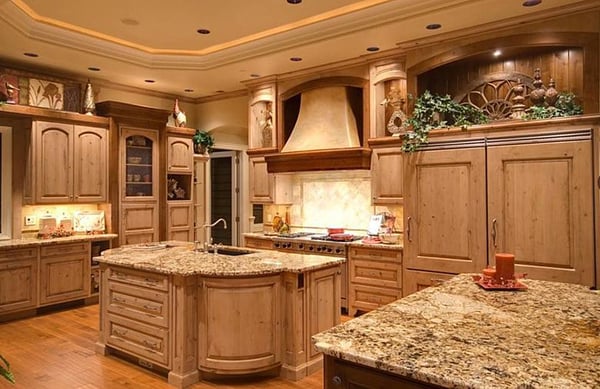
Website design trends remind me a lot of home design trends. A few years ago, everyone seemed to want wooden slat walls, black fixtures, vertical tile, accent walls, and extremely specific “modern farmhouse” details. For a while, those choices looked fresh. They made a home feel updated. They photographed well. They were everywhere.
But that is exactly the issue. When a design choice becomes too closely tied to a particular era, it starts aging the room almost immediately. You can walk into certain renovated homes and tell almost exactly when the work was done because the choices are so clearly attached to one moment in the design cycle.
Websites work the same way. A business may redesign its site to feel current, but if every major decision is based on what is trending right now, the site begins aging the moment the trend peaks. It might look impressive for a year or two, but it can start feeling stale long before the business is ready to invest in another redesign.
That does not mean homes should be boring, and it does not mean websites should be boring either. It just means the foundation should not depend on whatever happens to be popular this year.
Classic design lasts because it is built on fundamentals
The reason certain interior styles keep coming back is because they are built on stronger foundations than novelty. Traditional design, mid-century modern, art deco, Victorian architecture, and other long-standing styles are not timeless because every detail works in every context. They last because they have recognizable principles, proportions, materials, and visual logic.
Good website design works the same way. The sites that age well are usually not the ones trying hardest to look futuristic. They are the ones built around fundamentals: clear messaging, strong hierarchy, readable typography, generous spacing, intuitive navigation, fast performance, and obvious conversion paths.
Those things do not expire quickly.
A clear headline will not go out of style. A strong value proposition will not look dated next year. Easy navigation will not become embarrassing in three years. A page that helps the right visitor understand the offer, trust the company, and take the next step will continue to perform long after today’s favorite visual treatment has moved on.
That is the difference between trend-chasing and design maturity. Trend-chasing asks, “What does everyone think looks cool right now?” Design maturity asks, “What will make this website clear, credible, useful, and effective for the people who need to use it?”
Trends are not the enemy, but they should not drive the strategy
To be clear, I am not saying every design trend is bad. Trends can be useful. They can give a website energy, freshness, and cultural relevance. A dated website can absolutely benefit from more contemporary visual choices. There is nothing wrong with borrowing from current design language when it supports the brand and improves the user experience.
The problem is when the trend becomes the strategy.
A trendy layout cannot fix unclear messaging. A slick animation cannot make a weak offer compelling. A beautiful hero section cannot compensate for a confusing site structure. A modern visual style cannot turn a poor conversion path into a good one.
When businesses chase trends, they often focus too much on how the website looks in a screenshot and not enough on how the website works for a real visitor. The homepage might look impressive in a design review, but if users cannot quickly understand what the company does, who it helps, why it is credible, and what to do next, the design is not doing its job.
Design should support the strategy. It should not replace it.
The best websites feel current without becoming disposable
There is a middle ground between boring and trendy. That is where most businesses should aim.
A strong business website should feel current enough that users trust it, but not so trend-dependent that it looks outdated the second the internet moves on. It should have personality, but not at the expense of usability. It should look polished, but not like it is cosplaying as a company it saw on a design inspiration site.
This is especially important for service businesses, B2B companies, and companies using their website as part of a lead generation system. The goal is not to win a design popularity contest. The goal is to help the right people understand the business, trust the offer, and take action.
That requires restraint. It requires knowing when to use a visual trend and when to ignore it. It requires understanding that sometimes the “boring” choice is actually the more durable choice.
A clean layout, strong copy, helpful content, clear calls to action, and a well-organized site structure will usually outperform a website that is visually trendy but strategically thin.
If your website depends on a trend, it has an expiration date

The danger of chasing trends is that your website starts borrowing its credibility from the current design moment instead of building credibility on its own. It looks good because it resembles what is popular, not because it has a strong underlying system.
That is a fragile place to be.
Once the trend fades, the website loses the very thing that made it feel impressive. And because the design was built around a temporary aesthetic, the business is forced into another redesign sooner than expected.
A better approach is to build the website around durable fundamentals first, then use trends selectively as accents. Let the messaging, structure, user experience, and conversion strategy carry the site. Use visual style to reinforce those things, not distract from them.
That way, the website can evolve without needing to be completely reinvented every few years.
Build for clarity first, style second
Chasing design trends is how websites age badly.
Not because trends are always wrong, but because trends are temporary. They are supposed to change. That is what makes them trends.
Your website, on the other hand, should be built to support the business for longer than one design cycle. It should help people understand what you do, why it matters, and how to take the next step. It should be easy to use, easy to update, easy to measure, and easy to connect to the rest of your sales and marketing system.
A website can be modern without being trendy. It can be visually interesting without being gimmicky. It can feel fresh without being disposable.
The businesses that understand this build websites that age better, perform better, and require fewer panic redesigns every time the internet decides everything needs to look different.
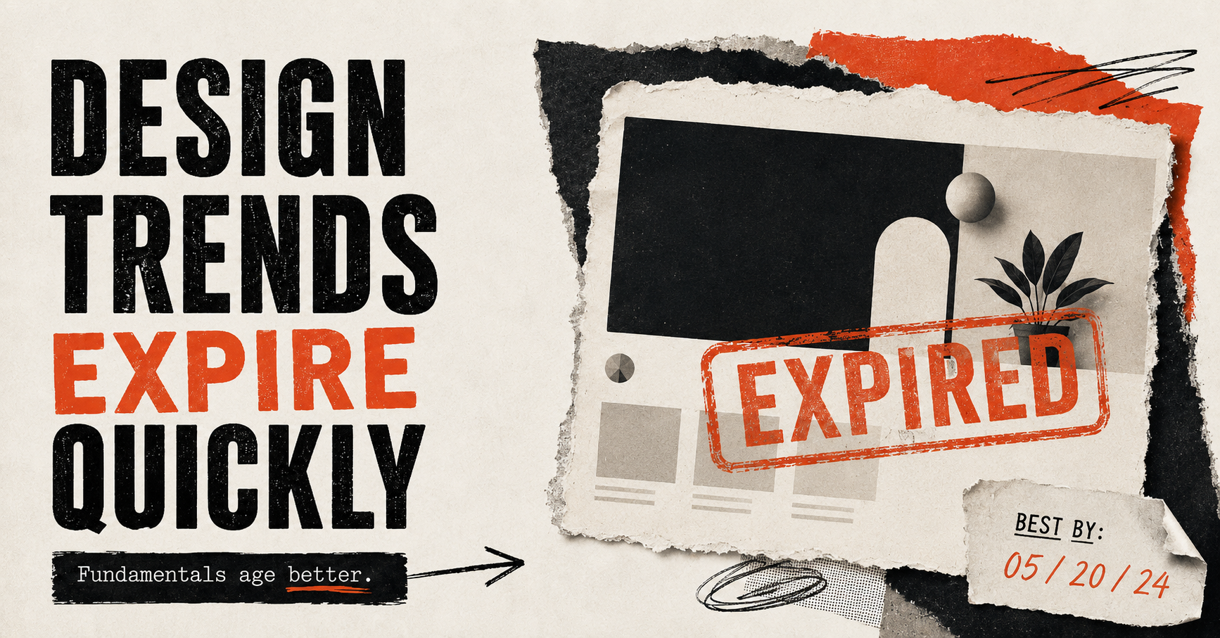
Trends expire quickly.
Fundamentals age a lot better.